Friday, April 26, 2013

Underexposure Practice

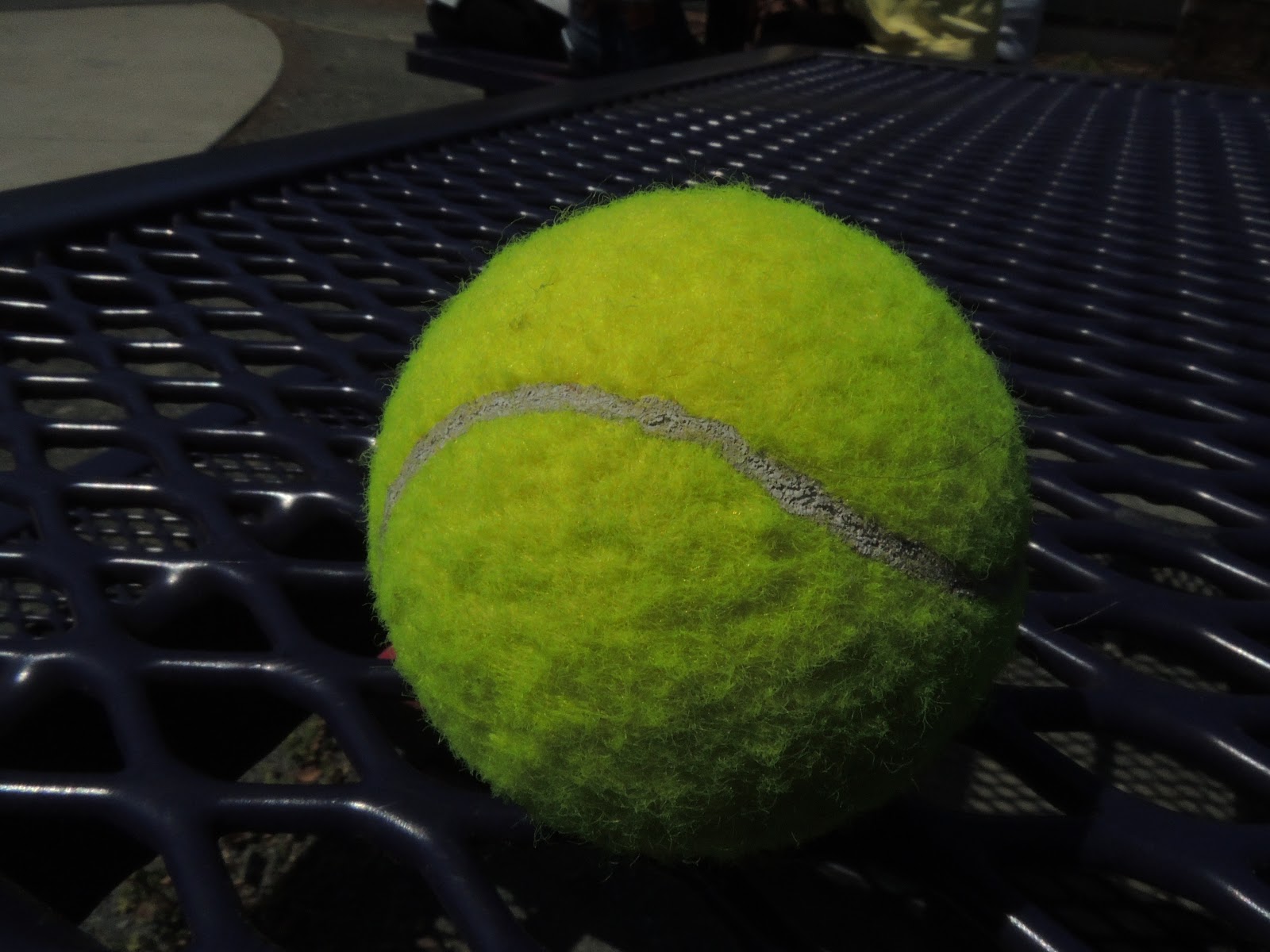
 For this photo, the iso was 400, the aperture is 8.3 and the shutter speed was 1/600.
The effects were the top of the ball was very bright and the bottom had a lot of shadow. This photo was balanced on the light meter.


 For this photo the iso was 400, the aperture was 8.3 and the shutter speed was 1/3200. This picture was -1 on the light meter and was much darker than the 0 photo. 


This photo was iso 400, the aperture was 8.3 again and the shutter speed was 1/4000 sec. This was even darker than the -1 one picture and was -2 on the light meter.

iso 100
was the darkest and showed more detail

 iso 400
was a lot brighter than the 100 and was a little washed out.

iso 1000
was a lot brighter and was very washed out

Friday, April 19, 2013

Light Effects


           For this lighting effect picture, I opened this photo in PS and created a new layer. Then I made a dot with the brush tool off to the side. Next I went to pen > free form pen and drew the pattern of the effect I wanted. Then I right clicked on the pen line and went to stroke path and made it brush. I changed the color to an aqua green. Then I went to layer > layer style> and outer glow. I used one of the presets call vivid light and changed opacity to 70%. Then changed size to 43 and spread to six and set the range to 50. Then I saved as and imported to LR and exported as a jpg. The outcome of this photo was a really cool neon light looking wrap around the bird and the color stands out even more since the rest of the photo is black and white.

Monday, April 15, 2013

Animals at the Oakland Zoo

 For this photo, I went to the elephant exhibit when the elephants were eating and waited until the elephant was turned towards me so the subject wouldn't just be a big rectangle. The trunk is out in front so that shows some depth to the picture while also showing how much they use it . The message of this picture was to show how old, and tired looking the elephant was. Steps for editing this photo were increasing the sharpness, contrast, and saturation. I also cropped the picture and used the old polar preset and added the vignette 2 effect. The elephant looks very calming and it feels like it's very close to you when you're looking at it.

For this photo I was at the gibbon exhibit and took a picture through a bush of a siamang laying on the ground looking up at his hand. The monkey looks very playful and curious in this photo. For editing I turned the photo to black and white, increased sharpness and contrast and turned the brightness of greens and yellows to 100 to make the black monkey stand out in the grass. then I cropped the picture and added the sepia preset with the vignette 2 effect. The overall message is to show how curious monkeys can be and how lazy they can be. 

For this picture I was at the blue and yellow macaw exhibit and it was good because there was no fence or anything to get in the way. The bird was perched up on a branch by himself. I vertically cropped this picture and increased contrast and vibrance and saturation. Then I used photoshop and used the lasso so select everything but the bird and made a black and white layer. To me this bird looks very smart and it was tipping its head looking right at me so the viewer feels close to the subject.

For this picture, I was at the gibbons exhibit in the morning so the monkies were out getting ready to be feed. They were swinging around and the female was looking right at the male and since they are a couple, you can see their connection. For editing I decreased exposure and increased sharpness, and saturation a little. Then I added the cross process 2 preset and cropped the picture so there wasn't a lot in the background. This picture shows how similar monkeys can be to humans, by the relationships they form and all the different facial expressions they make. 

Wednesday, March 6, 2013

How I Roll


All of these pictures connect to me and how I roll because sushi is something I really like. I think I could eat sushi any time, any day of the week. Also, I made a sort of pun out of how I roll and did how I "roll" like sushi rolls literally. Also, This last picture represents how much and how fast I can eat.

Friday, March 1, 2013

Shutter Speed Practice

 For this picture, I set the shutter speed to 1/30sec. I then set the aperture to f8.0. Then I told Riley to toss the ball up and I took the picture when I saw his hand move. This picture was very blurry but the ball movement is still visible. 

For this picture, I set the shutter speed to 1/60sec and the aperture to f8.0. Then I took the picture when I saw Riley's hand move. This picture was less blurry than the 1/30sec photo.

For this picture the shutter speed was set to 1/800sec and the aperture to f8.0. Then waited until I saw the ball in the air. For this picture the ball was a lot sharper than the previous pictures. 

Friday, February 22, 2013

Texture Layers


For this texture project, I went outside and took ten pictures that involved a lot of texture. Next I imported those images to LR and edited them mostly with tone curve and exposure and highlights, shadows, and midtones. Next, I exported the one I wanted, the bricks to the desktop. I then chose a picture that I'd taken previously this year of my dog on a trail and imported that to LR and edited it with the same things I edited the texture photos with. Next I imported the dog photo to PS and changed the size to 9 by 6. Next I imported the picture of the bricks to PS and changed the size to 9 by 6 also. Then, I selected all, copied and pasted the bricks to the dog photo. Then while in the bricks layer, I went to layer, layer styles, the to blending options. In blending options I changed opacity to 35%. Last, I created a layer mask for the bricks in layer, and clicked on the paint brush and changed the size to 63 and the color to black. Then I painted over my dog. To me this made my dog look like it was popping out and 3-D.

Wednesday, February 20, 2013

Text


For this project, I started with a new 4x6 document in PS. Then I selected the gradient tool, and selected the vertical- horizontal one. Then over on the left side, I changes the siders one the different colors until I got colors that I wanted. Then I clicked and dragged across the whole frame. Next, I used the text tool to type in shazam! I then changed the color of the text. After that I clicked on text warp and clicked on wave. I changed the three sliders, horizontal, vertical, and diagonal until the word was in the desired position.